Tuesday, December 14, 2010

Week 15 Exercise

Photo Credit: http://www.allthingsdisneyonline.com/VinylmationKermitMouse.jpg

This image posted above demontrates the Symbolic AND Recognizable aspects of design.  To start off with the symbolic nature, the toy is in the shape of Mickey Mouse which highly symbolic in regards to Disney.  With the ears, gloves, and clothes,   it is pretty evident that it is taking on the shape of Mickey Mouse.  For the recognizable aspects, this would be the way that the toy is colored.  It can be seen that it was not colored in a way for it to be Mickey Mouse.  It can be seen as Kermit The Frog. The eyes, mouth, and shapes under his mouth are highly recognized to be those of Kermit and not Mickey Mouse.  Not to mention, that the different placement of the actual eyes and mouth of Kermit are not placed where Mickey Mouse's eyes and mouth are.

While it is clear what this item is with the supplies in place, if you were envision it empty, it would display the abstract aspects.  The particular shapes of the openings do not suggest a specific item.  It still does however, give you the notion that the product itself is for use to store or organize whatever it is you may have.  The way that the openings and the base is positioned is very similar to if a person was to just assume a place or item is for sitting down.  The item is not shaped to resemble anything, but from the way that it is put together, the method of usage is clear.

Tuesday, December 7, 2010

Week 14 Exercise - Representational, Abstract, & Symbolic

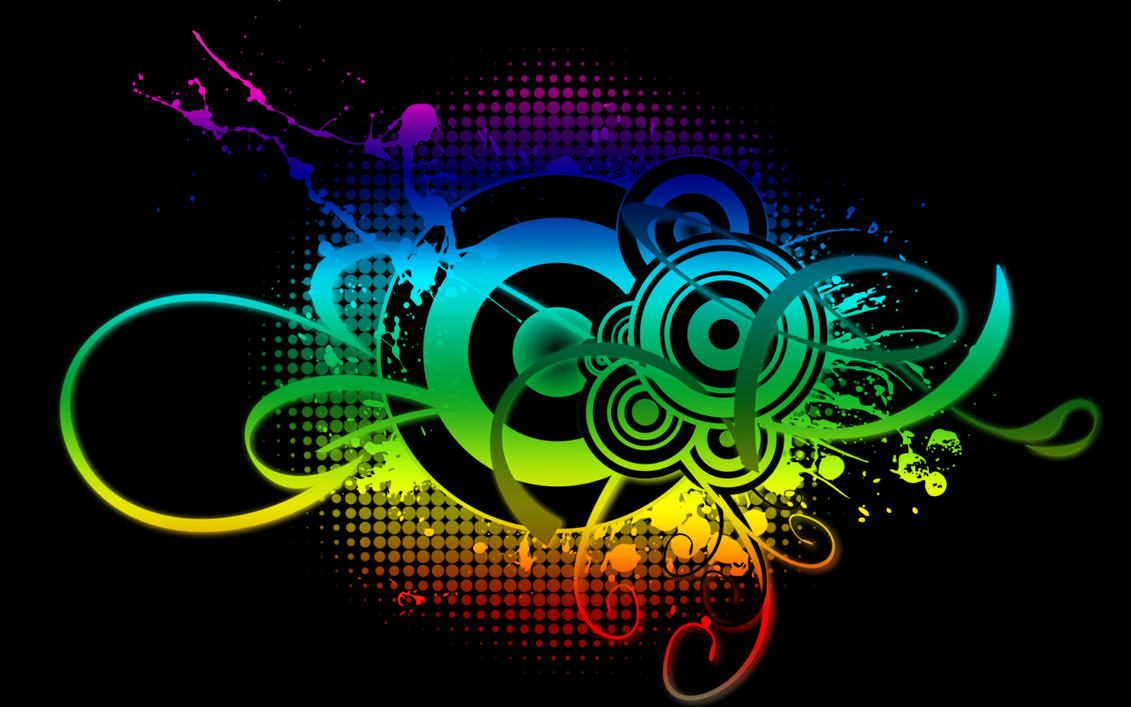
 Photo:http://th09.deviantart.net/fs71/PRE/f/2010/298/2/2/abstract_music_by_nabster18-d31gz7b.jpg

This is the example of abstract level of design.  From the picture, it just looks like shapes, lines, and colors, thrown together.  But from the certain shapes, you can throw the story together.  First, we have the display of circles in the middle.  From looking at these, they can be seen as either speaker cones or records which can be the source of sound and music.  The lines can show the sound waves that show the path in which they travel in.  Lastly, there are the circles in the back that are arranged and fade to the end with smaller circles.  These can suggest the pulse created from music.  The pulse that the bass and lows create that hit hard at first and fade off periodically.

---------------------------------------------

 Photo: http://blogs.villagevoice.com/statusainthood/ti_l.jpg

This would be the representational level of design.  In this picture, the artist, T.I. shows the two types of people he has been in his life.  On the left, he represents his lifestyle and personality growing up before he had matured.  The baggy jeans, tank top, tilted baseball cap, gold chain, rubber band, milk crate and stereo represent the life of growing up in the inner-city environment where this is common.  On the right side, you see him dressed in what appears to be a tailored suit.  This suit represents the business man that he had become as well.  It is the likely attire in many corporate buildings with CEO's, Executives, and other leaders of companies.  It represents a more mature and sophisticated side.


---------------------------------------------


 Photo: http://blogs.the-american-interest.com/wrm/files/2010/03/United-nations-peace-sculpture.jpg

This is the symbolic aspect, which symbolizes a cry for peace.  In this scuplture, the barrell of the gun is tied in a know.  The knot is the stop of bullets flying out of the barrell.  The bullets that would more than likely hit someone or something.  It shows one way to stop the violence by putting guns down.  The knot would work similar to a hose.  Where if you were to tie or fold a hose, the water would be stopped from spraying out.  This works in the same way where it would suggest a stop in gun violence and violence in other forms.

Tuesday, November 16, 2010

Week 12 Blog Exercise / Visual Techniques

 Nike Air Foamposite 
-Irregularity, Intricacy, Depth, & Complexity -

Picture Credit: http://www.kicksonfire.com/wp-content/uploads/2008/09/nike-foamposite-one-black-dark-army-1.jpg


Nike Toki 
-Regularity, Economoy, Flat, Simplicity- 

Photo Credit: http://www.deadstock.ca/images/emailers/december%2030th/nike-toki1.jpg


The shoes posted above are the Nike Foamposite and the Nike Toki.  The Foamposite displays a style of shoe that is very different from any other.  The lines and slihouette are irregular and intricate with an almost seamless and round shape that goes all the way around, not to mention the lines that go up and down all around the shoe.  The Toki is a lot more regular and economic in the design.  There is not really anything that is shocking about the design.  Nike took the simple and clean look without taking any risks which is.  flatness and depth is also displayed in the two shoes.  The Toki is flat all around considering the exterior of the shoe does not really go in or stick out greatly anywhere around the shoe.  The Foamposite, however, has lots depth shown from the indentions on the sides as well as the carbon fiber plates that extend in the middle to provide extra support.  Complexity and simplicity is a technique that goes deeper than just the looks of the shoe.  The Foamposite takes on complexity in the design as well as materials that they used for the shoe.  The Foamposite has foam that makes up the shape of the shoe.  The foam, although stiff when first purchased, softens and molds to your feet as your feet produce heat when worn during the day.  The Foamposite also has Zoom Air in the soles that provide extra comfort.  The Toki, on the other hand does not use such technology in the design.  It is just leather that wraps around your foot with out anything complex about it.  


Tuesday, November 9, 2010

Week 11 Contrast Blog Exercise

Photo Credit: http://www.aboutsneakers.com/wp-content/gallery/373/mr-cartoon-livestrong-nike-air-force-one-kicks.jpg

In this example, the shoe, which is the Nike Air Force 1, shows a great example of contrast.  This shoe was designed to be part of the Live Strong campaign which explains the use of the color yellow.  The black used works great with contrast to make certain areas of design pop-out.  The laser-cut designs are precise and show the story of the shoe.  The shoe shows art from Mister Cartoon, a Los Angeles tattoo artist.  All the designs shown with the contrasting yellow and black are all traditional of the style of Mister Cartoon and is placed all around the shoe tying everything together.  

-----------------------------------------

Photo Credit: http://www.sneakerdemon.com/wp-content/uploads/2010/01/Nike-Air-Force-1-High-Womens-Black-Metallic-Gold.jpg

This would be a poor use of contrast on the same model of the shoe above.  This would be a black on black design, except for the difference of fabric and texture which does contrast which each other.  There are dull and shiny parts of the shoe which shows the design that is all over the shoe.  However, you cannot tell exactly what is going on here.  The design can be seen with proper lighting, however it is still very hard to configure the design.  The texture of the different parts of the shoe as well as the design lead you to be lost in finding their inspiration or goal for the shoe.


-----------------------------------------

Tuesday, November 2, 2010

Week 10--Movement/Motion

Photo Credit: http://www.laptoppicker.com/archives/kohjinsha-e8-mini-laptop.jpg

In the above picture, they show a lap top that has a feature different from other traditional laptops.  Most laptops simply just open and move in one way to show the screen above the keyboard.  However, in this picture, they show that once the laptop is open, there is still one more motion the screen can do.  The screen here can also pivot and turn to face other ways.  The swiveling motion can allow the screen to be seen by people other than the primary user if turned that way. If the picture was taken with the screen down, it would not show many features.  It would be hard for the consumers to see what the keyboard looks like as well as the screen.  And most importantly, they would not be able to see the most highlighted feature of being able to turn the screen.

-------------------------------- 


 Photo Credit: http://static.phonesreview.co.uk/wp-content/phoneimages/U900_G2.jpg


This picture above is now of a cellular phone that flips open.  When it is just closed, you can see that the only available features are what looks to be a music player and the screen for the clock.  In the cellular phone however, is shown with it half way open.  From there, you can see that there are more features on the inside.  In which it would more than likely be what would be used to actually operate the phone.  On the inside, you can see that there are some buttons that are visible to suggest that there are more to this device once it is opened up.  It is important that the company took the picture with it half way opened.  With this angle, it clears up that you must flip it open if all you see is the clock, camera, and music player buttons.


Tuesday, October 26, 2010

Week 9 Blog Exercise – Dimension/Depth/Space

Photo Credit: http://uaesm.maktoob.com/vb/attachments/51497d1175718133-lexus-ls-600h-l.jpg

With my focus on Product Design & Development, I noticed that cars have various areas which are all done by product designers.  Both interior and exterior of the car as well as the parts to make it work go through some sort of design process to make it all work together.  The picture above would be an example of designed physical space.  The designers had to design not only the actual objects inside (steering wheel, seats, navigation system, etc.) but also the 3D space inside the car for those object to fit in as well as the enough space for the riders of this automobile to fit as well.  Not only did these items have to fit inside with the riders as well, but the designers also had to make sure there was enough space for people to use and operate such features inside the car.  This pictures shows the dept of how much space you will be expecting to have when inside.  The steering wheel and dashboard seem to be farther away to emphasize a large amount of space and luxury inside.  The perspective shown is also almost dead center in which you can see the boundaries of the space extending behind you almost as if there is a vanishing point inside the car. 

Tuesday, October 19, 2010

Week 8 - Tone & Color

Photo credit: http://2.bp.blogspot.com/_RoiyLOZ6PdY/R7nW221XphI/AAAAAAAAAHY/sH6eGO682Tw/S483/air-jordan-xx3-23.jpg


In this picture, I really liked how the photographer at Jordan Brand used a wide tonal range to highlight the new features of the shoes.  There are many parts of the shoe, such as the suede and the shoe laces can almost go unnoticed as their tones are very near that of the background of the picture.  The other features such as the plastic around the toe, signature script around the front, and the grey and red accents from the embroidery designs can be seen from the higher saturation and contrast that the lighting brings.  I think the tone also creates a mood of mystery and elegance.  The mystery comes from the subtle highlights of certain parts of the shoe that almost makes you want to see it in person or at least see more of the shoe it self in different pictures. The color, or lack there of, show a different take on the basketball shoe.  Jordan Brand had used just blacks and greys with a hint of red on the shoe.  With less color, the shoe has a more grown up and mature look.  The color gives it sleekness and also "quiets" the shoe by using less loud colors.  The only color, red, did serve well as it shows great contrast that can lure the customer in.